
Subscription Configuration Experience
Pattern design to integrate new features in the quoting and order placement product area in VMware Cloud Partner Navigator
Background
VMware Cloud Partner Navigator (CPN) is an unified platform for VMware partners to manage subscriptions, customers, and deliver multi-cloud services. There were three CPN UX designers and most of our feature work was related to the quoting and order placement tool called “Configurator”. The Configurator is a multi-step wizard, like an e-commerce checkout experience, with rules and actions per step. As different new features were being added, I designed the Configurator framework multiple times to meet business goals without sacrificing simplicity. In this case study, I will focus on the “Base Offer” step within the Configurator where partners select subscription offers and how that experience evolved as a pattern.
I’ll be going over the iterations and considerations behind each one. These designs were made across 4-5 features work in the 3 years I was with this team.
Deliverables
Multiple full UX flow from landing page to confirmation page
Pattern design in the context of feature work
Starting Point
When I came to CPN, this was, more or less, what the Configurator looked like. The user selects a Saas service they want to purchase, and once selected, they come to the Configurator to go through the steps of placing the order. In most cases, there are 3 main steps:
Order Setting- where user fills out information on country, currency, and business segment
Base Offer- where user selects subscription base offers and their add-ons, and fills out customizable options per base offer/add-on
Review- where user views a summary of their choices and input and places the order
Below is an end-to-end flow from landing page to the last step.


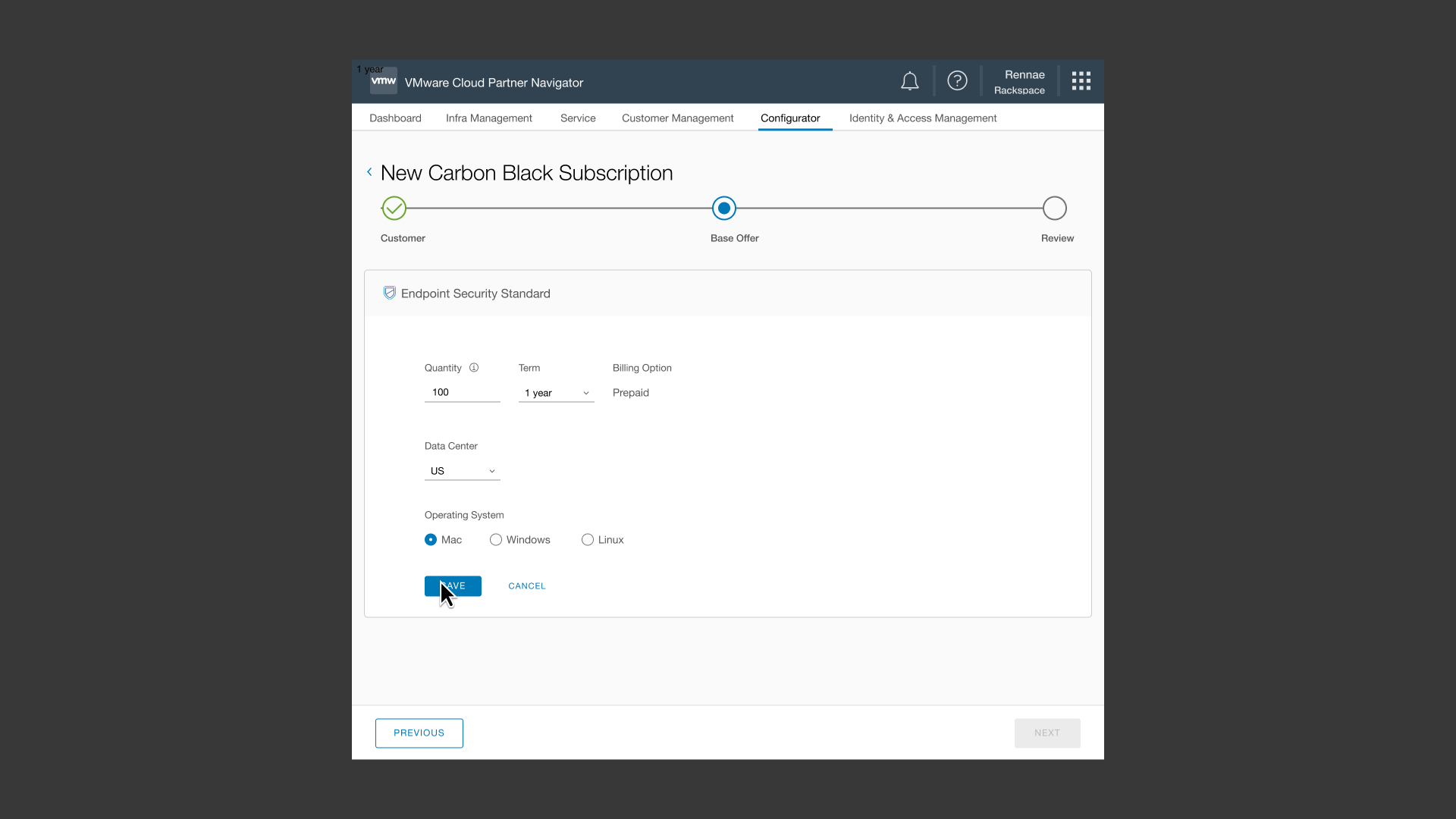


Within the Base Offer step, here are some of the actions a user could do:
Selects a base offer
Fills out that base offer’s settings: quantity, term, billing, and etc
Save the base offer’s settings
Edits the base offer’s settings
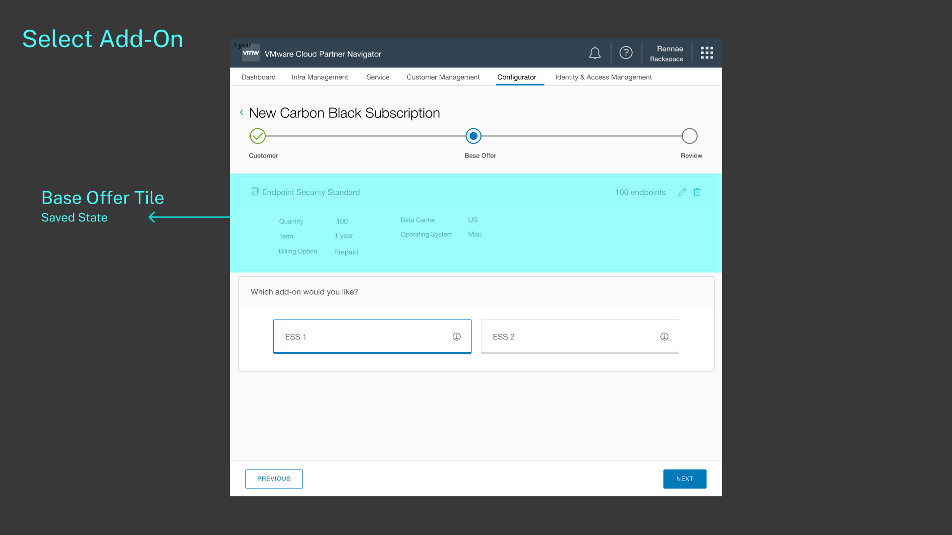
Add an add-on if available
Fills out add-on’s settings
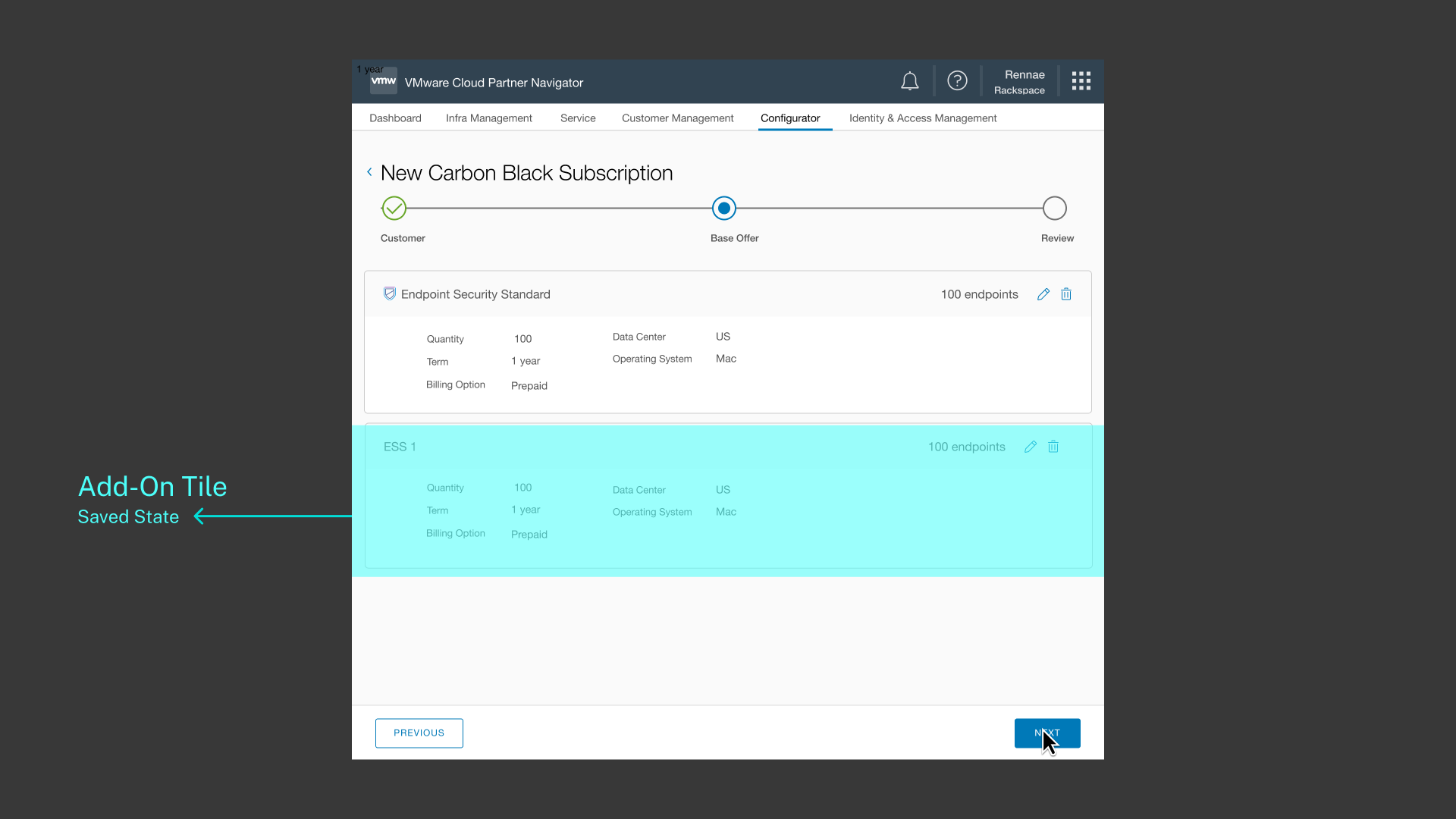
Save the add-on’s settings
Edits the add-on’s settings
New Use Cases
One of the ongoing work for CPN was integrating and making available other VMware products for partners to purchase for their clients. The design and technical challenge was working with different purchasing rules and formats, and aligning them to fit the Configurator framework. Here were some business cases we had to design for:
Offer subscription bundles
Offer customizable bundles
Convert partners’ legacy license keys into subscription services
And this is what it means for the pattern design:
The product card needs to be able to accommodate more description
The content area needs to be an interactive experience where a user can add multiple base offers
The visual design of base offer tile needs to be simplified

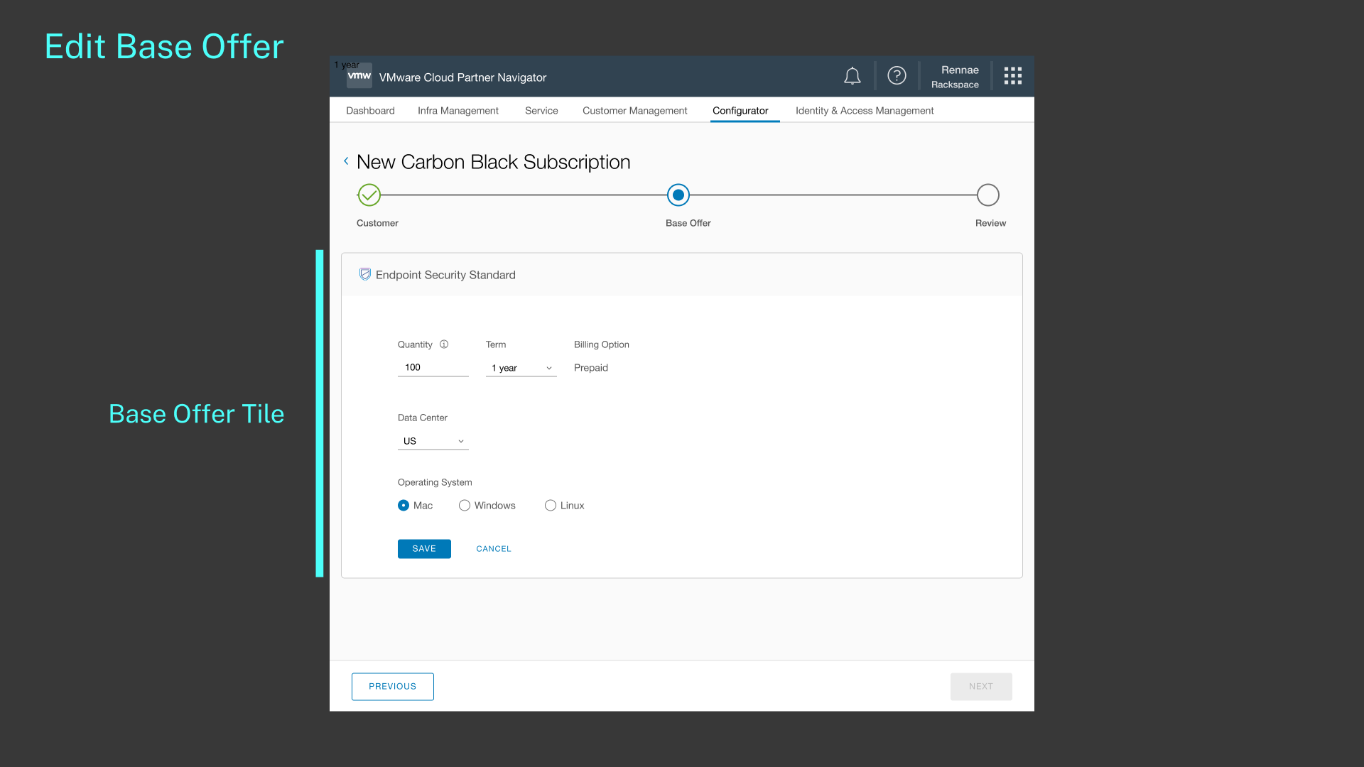
Adding Multiple Base Offers
For the purposes of this case study, I will focus on the development for the content area for users to add multiple base offers. The design opportunity for this was, how might we allow users to add multiple base offers without complicating the process? Some of the ideas proposed were:

Adding additional steps in the timeline
This idea didn’t work because it’s not scalable. Although the average case is just 1-3 base offers, it still wasn’t future-proof if this UI was ever to accommodate the extreme case.

This idea didn’t work because it’s not scalable. Although the average case is just 1-3 base offers, it still wasn’t future-proof if this UI was ever to accommodate the extreme case.
Adding dropdown list under the Base Offer step
Adding dropdown list under the Base Offer step
This was more scalable than adding timeline steps, and this particular Clarity Design component allowed lists particularly for steps within a step cases. However, visually, I found it unbalanced that only the Base Offer step would have that, and not every step of the timeline. It also wouldn’t scale if we needed to display more information or states of each item. And what we’re adding were not steps, these were more objects being added to a “shopping cart”.

Adding prompts whenever the first base offer is saved
The current design of how a user selects add-on’s is that they’re prompted to select one after the first base offer is saved. The idea is that we would be displaying a linear sequence of questions to prompt users to add base offers or add-ons. But this idea was quickly dismissed because the fact is this interaction was not linear. The user needs the flexibility of being able to add, remove, edit, in different order of events.

Adding an interactive sidebar
This idea was the final design we went with in the end. Up until then, the content area was not thought of as a canvas experience, all steps had to live within the tile, which always held a title or question, and different form options underneath. But when I started to think about the base offer tile as an object, it became clear to me that I needed a shopping cart type of experience. I needed a way for users to add base offers, and view all the offers they added at one glance.
Results and Thoughts
The product manager and engineering leads all thought my final solution made sense and much more future-proof. One thing I thought about more but don’t have an answer for is whether this solution make sense when most cases would just be one or two offers. I designed it for the extreme case that even if it’s a big number, it would still be scalable. But if for most cases, it’s only 1 or 2 offers, then the sidebar takes up the entire left side without really needing to. And visually, the button feels unanchored and floating. If I could work more on it, that’s what I would focus the next iteration on.