Policy Analytics Visualization
Re-design work for Cisco DNA Center, involving research and design on the best data visualization to help users understand endpoints traffic communcations
Business Background
Most large organizations, like companies or hospitals, need to segment their network in order to protect critical business assets, such as servers and databases. The business unit I worked had innovated a more agile and secure way of achieving network segmentation than traditional segmentation. Endpoints, or anything that connects to the network like laptops, printers, MRI machines, phones, elevators, are classified and managed as human-friendly logical groups. By doing so, security admins can enforce network policies, or rules governing which group can access which group, without worrying about the underlying network infrastructure.
User Story
Security admins need a way to explore how different groups of endpoints communicate with one another to make informed business decisions.
My Role
I co-led the design with a senior UX designer on the team. We also engaged with Clever Franke design agency halfway through the project, and I assisted in managing two contractors on this project. I co-led the design from end to end: concept, sketch, wireframe, prototype, art direction, and high-fidelity production.
Results
Successful release for beta users
Starting Point
My business unit had been working on this network segmentation product for over 3 years before I joined. A large portion of the main landing page was the visualization for endpoint group traffic. This landing page experience went through a lot of iterations. When I joined, the design process was at its exploratory stage.
These were some of the high-level design goals for the visualization:
User needs to understand that he’s looking at the traffic data from the source endpoint group to the destination endpoint group.
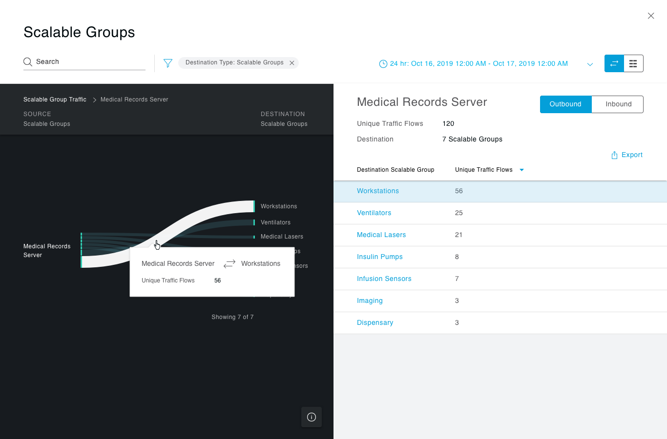
User needs to be able to drill down on one source endpoint group, and see all the destinations.
The visualization needs to show the volume of traffic, the names of the groups, and the connection between source and destination.
The visualization needs to deliver a “wow” moment for marketing and sales’ purposes.
Here were some ideas that were explored before I joined the team:

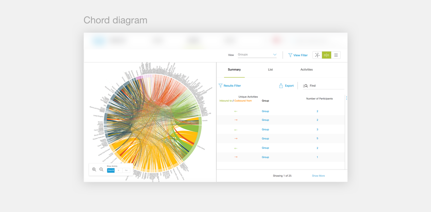
Chord Diagram
The chord diagram idea looked impressive, but it was almost impossible to make sense of it because of the scale of the data. There were thousands of endpoints, and though it does express the concept of “communication” between two groups well, it’s hard for user to select a group to drill down.

Tree Map
The tree map idea is definitely more usable and understandable, but it also did not solve the issue of scale very well. The team also had a hard time deciding what were the top five groups to show, and it was hard to define “top 5 groups” since traffic volume isn’t necessarily an indication of importance. It was also visually monotonous.
My Explorations
These were some of my explorations after I joined the team:

Connection Map
The connection map showed the concept of groups by representing each group as a circle. The volume of traffic was represented by the thickness of the lines between two groups, and this was only shown when someone selects a specific group. The initial map felt overwhelming, though, and the pagination solution felt awkward.

Bubble Chart
The one-dimension bubble chart was an attempt to simplify the landing screen, so we didn’t have to show so many groups. The endpoints groups are clustered together by the approximate traffic volume. But when we tested this with real users, no one could understand what the visualization meant. One of the key product stakeholders also did not approve of this approach.

Sankey Chart
At last, we landed on the Sankey chart idea. And though it’s not perfect, this visualization fit what we needed. It represented the traffic well on first-glance. It translated well to pagination and progressive reveal, so it resolved the issue of scale. When we tested this with users, people understood it immediately.
After we landed on this direction, I became the only designer on the team, so I was responsible for taking this to the finish line. Some of the interaction design challenges are listed below:
The tabular view of the landing screen
The split view of the one to many screen
Showing direction attributes on the table
The filter component and its mechanics
Showing different types of groups
The legend
How the scroll works
How to show “more” per group without pagination
The hover interactions


Learnings
This was my first experience diving into data visualization in a project. I was unfamiliar with all the different chart and diagram categories, and there was constant tension between what’s visually impressive and what’s solving the users’ needs. One thing I learned is that with data visualization, it’s hard to say if it answers the right questions until you try it and test it.